Grandy
Problem: 28% of elderly people live alone. There is no system to help those without friends or family who need assistance. Additionally, the lack of companionship can be lonely and isolating.
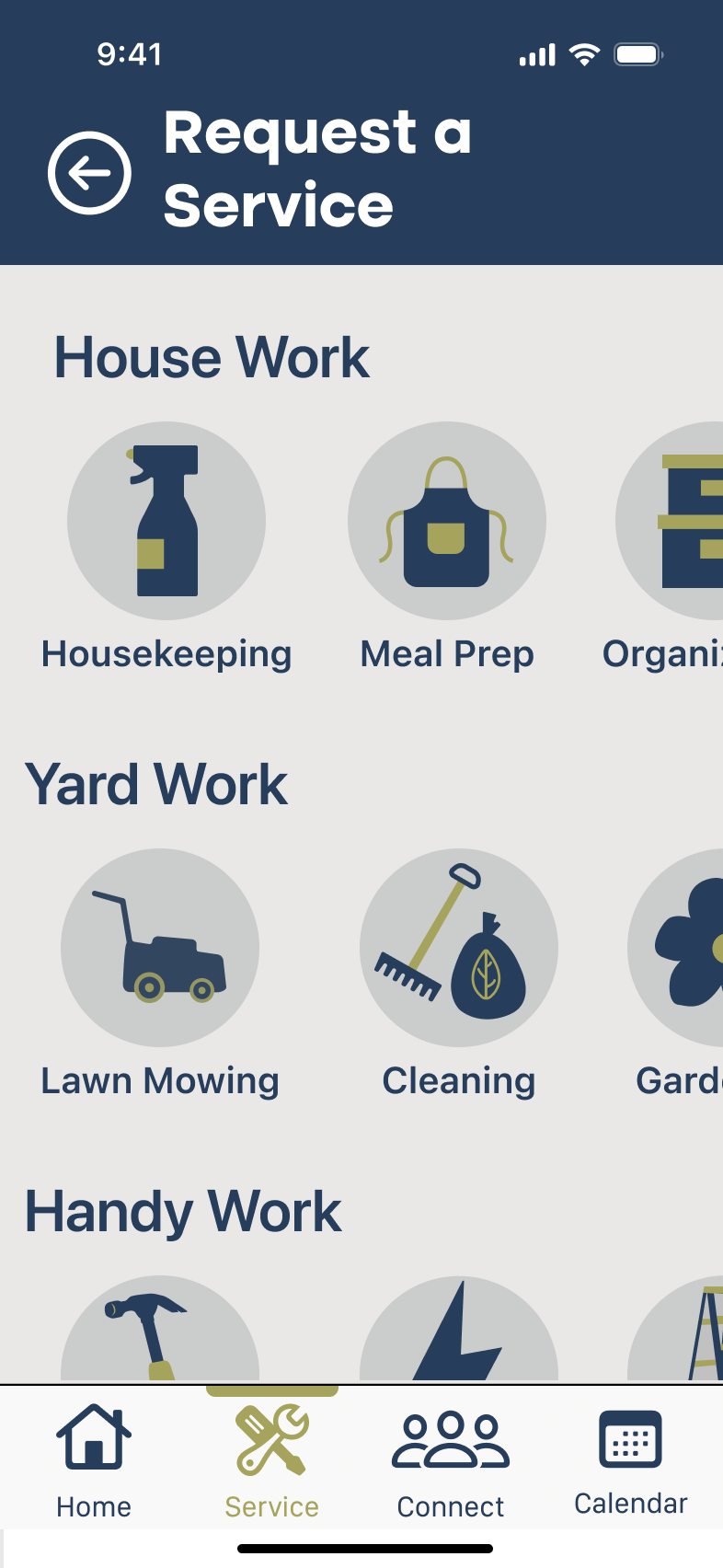
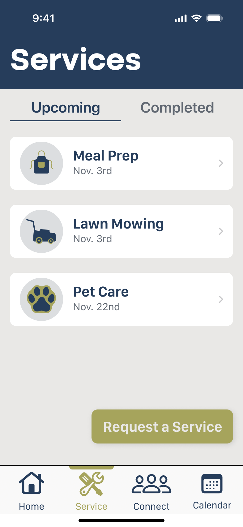
Solution: a mobile app designed for seniors to book and receive services and build connections with other individuals.
Design process:
Empathize 2. Define 3. Ideate 4. Prototype 5. Test 6. Iterate
Empathize
Competitor analysis: Through a competitor analysis we identified three companies with the same offerings or target audience, and analyzed what their strengths and weaknesses were. Carelinx seeks to serve elderly individuals, but their services were limited, and their platform was not senior-friendly. Users would still require someone with tech-savviness to book services. Care.com served a larger target audience, including those needing senior, pet, and childcare. Their platform also requires users to be tech-savvy. Angi, while having a well-organized platform and offering a variety of home-related tasks, is for all ages, is not senior friendly, and does not provide health and emotional related services.
Interviews: with this information in mind, we conducted interviews with seniors (those over 65) and children of elderly individuals to gather more information on their current needs, how those needs were or were not being met, and their experience with smart phones to gauge their tech capabilities.
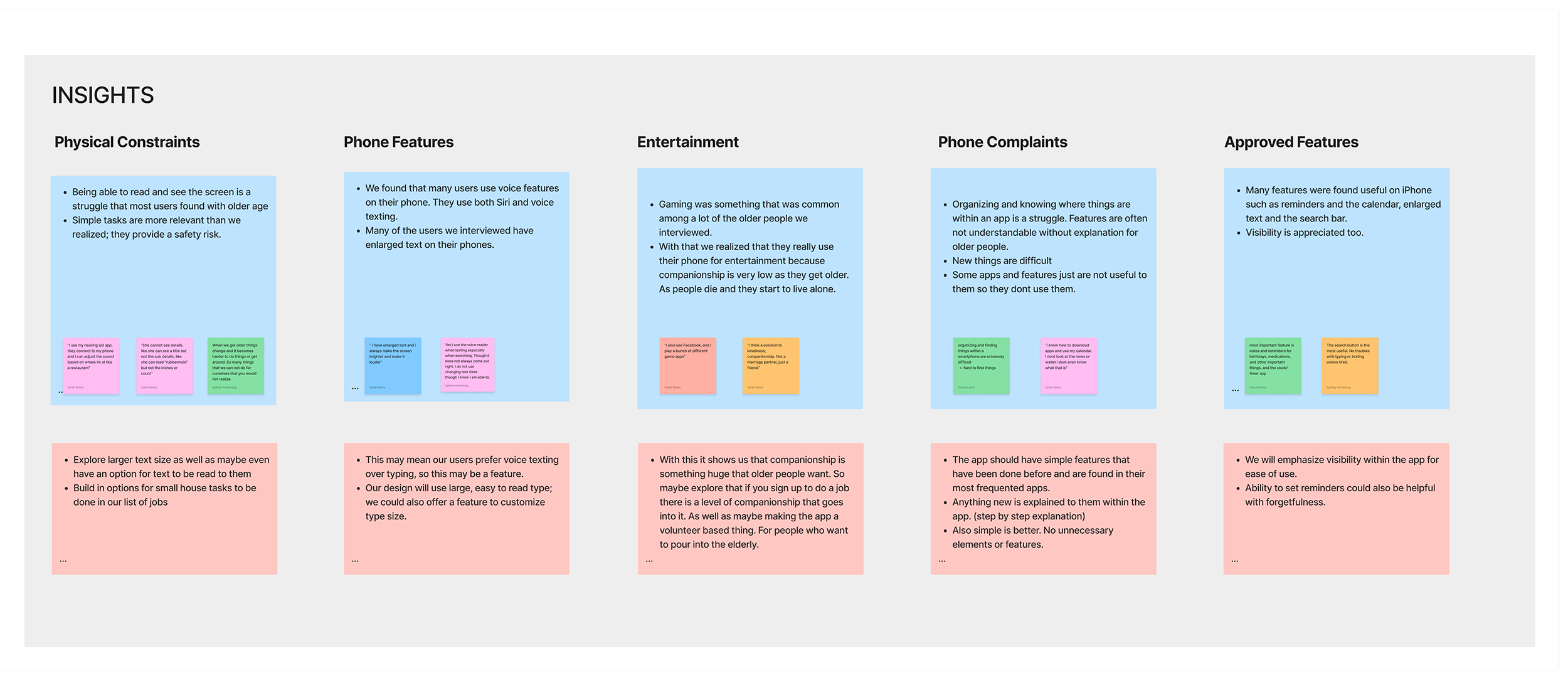
Affinity Map and Thematic Analysis: We extracted quotes from our interviews and arranged them into an affinity map. We then sorted these quotes by common theme and information. This revealed common themes about features they did and did not use on their phones, reasons they use their phones, and what physical needs they have on a daily basis. Key insights uncovered were physical limitations elderly individuals have, phone functions they found useful and easy to use, and a recurring use of technology for entertainment or social interaction.
Define
We then created the user persona, Charles Gilmore. Charles is an 82-year-old widowed man who lives alone. By creating a persona, we were able to put ourselves in our users’ shoes and create a user journey map. This was to develop a scenario where Charles needs help. This journey helped to identify our users needs, some of his pain points, and his emotions during a daily task. Charles and his journey revealed his need for help from outside individuals, his inability to drive, and the value of connection and conversation with other people.
Ideate
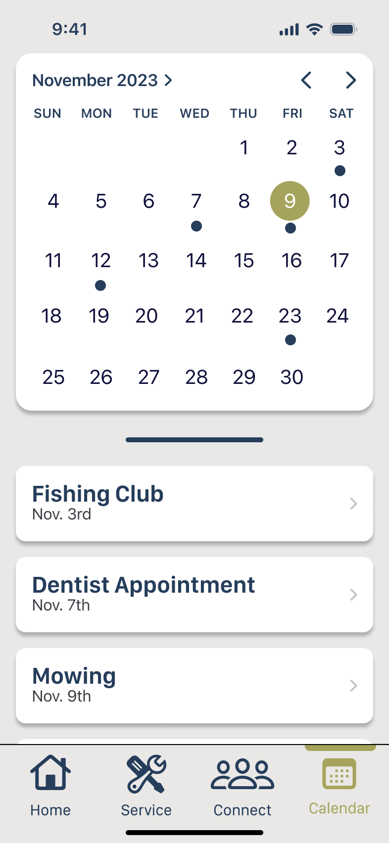
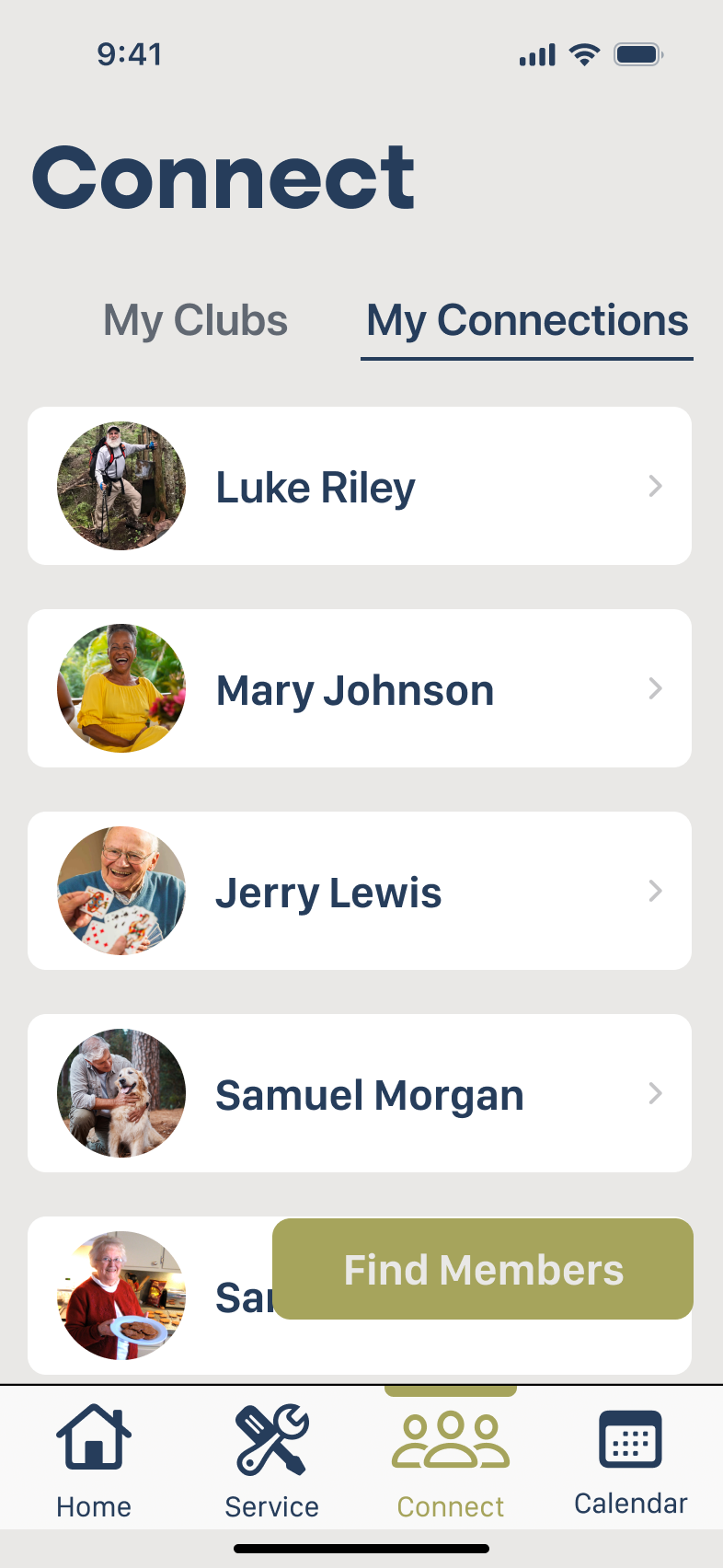
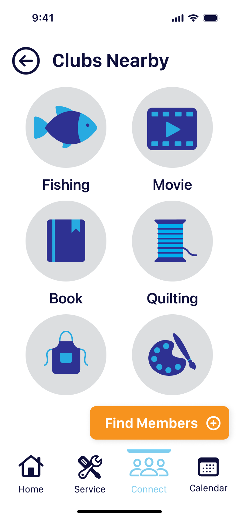
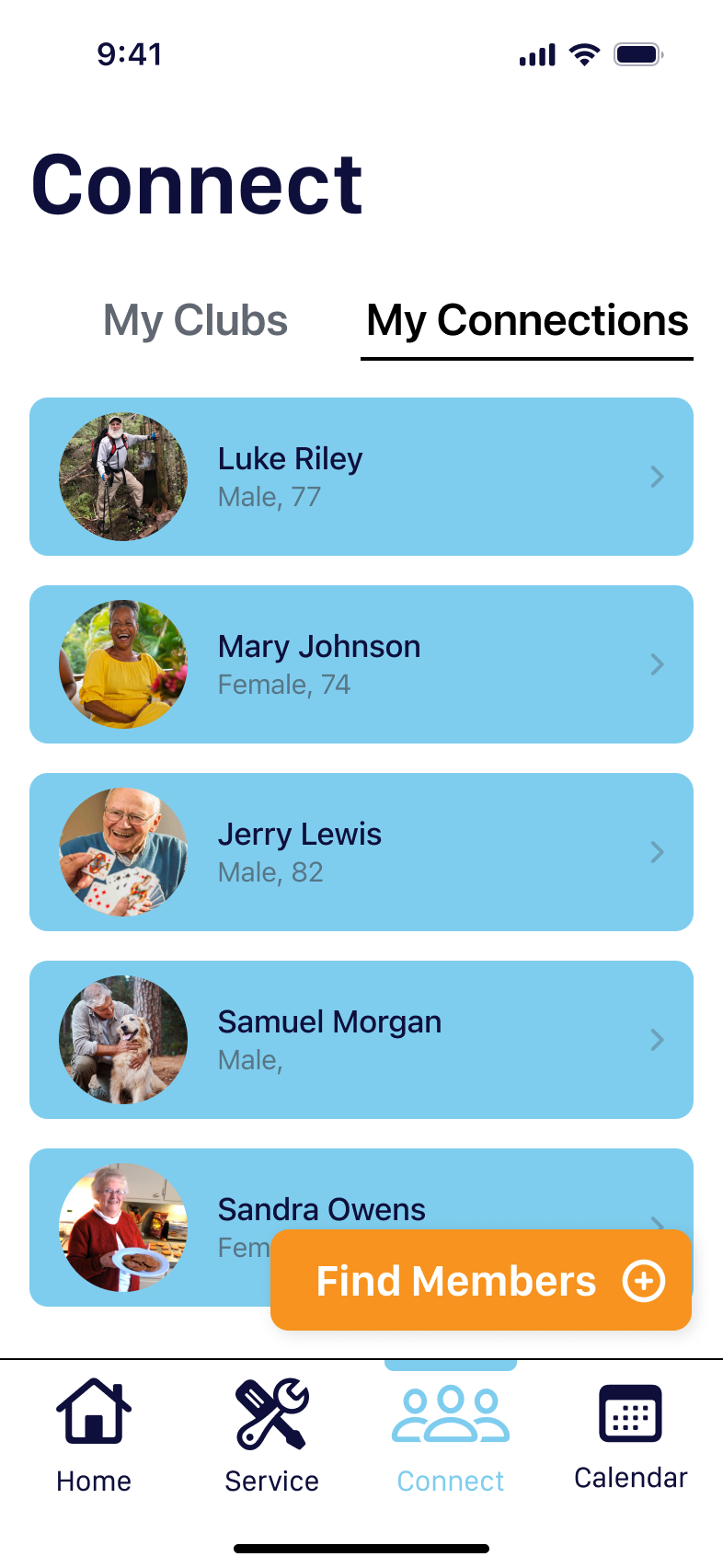
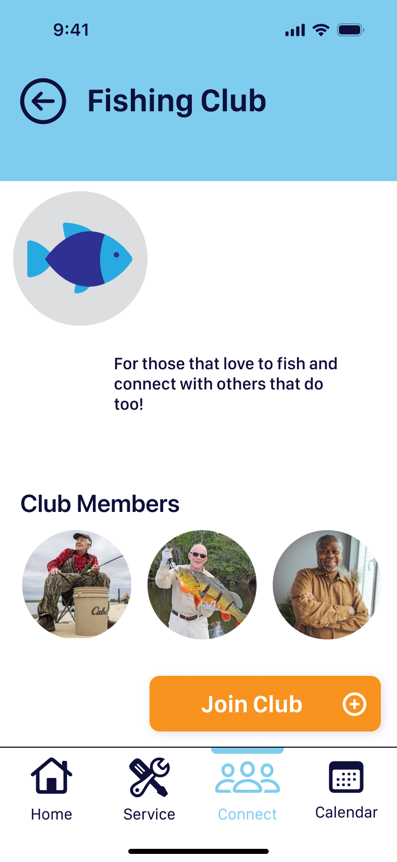
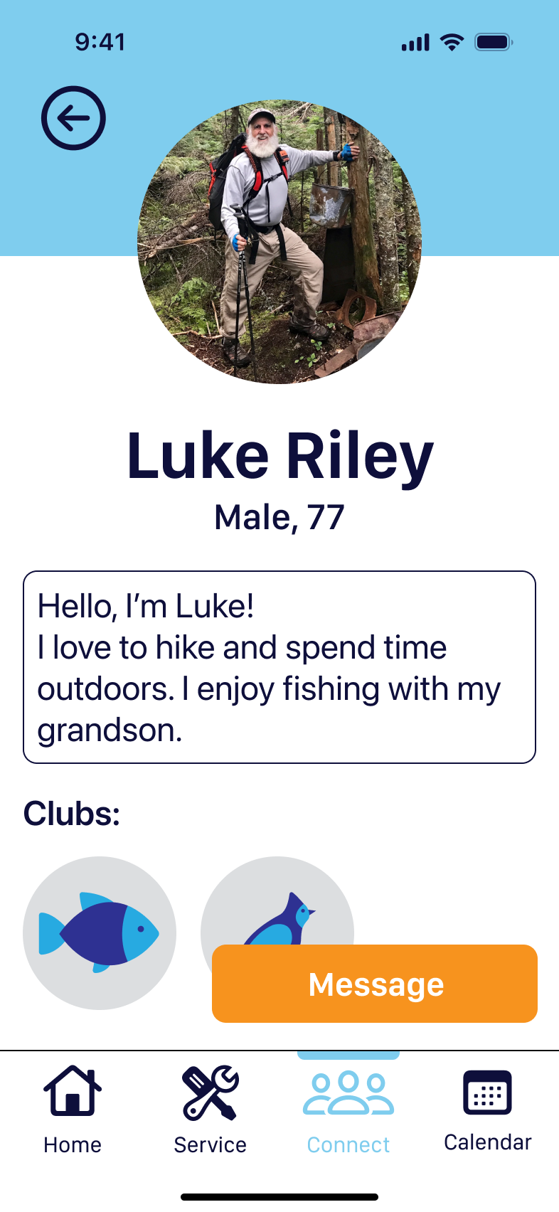
Creative matrix: keeping in mind our personas and their wants and needs, we constructed “How Might We” questions. These aimed to define the scope our project and what problems our design addressed. Using a creative matrix, we brainstormed ideas to solve each problem the question addressed. Several questions/solutions surrounded ideas of making the app usable by seniors. This included ideas about, simple design and functionality, color choice, and large font size. We also chose to implement a calendar for memory assistance. The question that played a pivotal role was “How might we make our app sustainable while promoting volunteers?” Suggestions such as “user profiles” and “having high-functioning app users help other users” evolved into what is now the connection portion of our app, one of the two primary functions, which further divided into connections and clubs.
***sketches
1. Prototype (lo-fi)
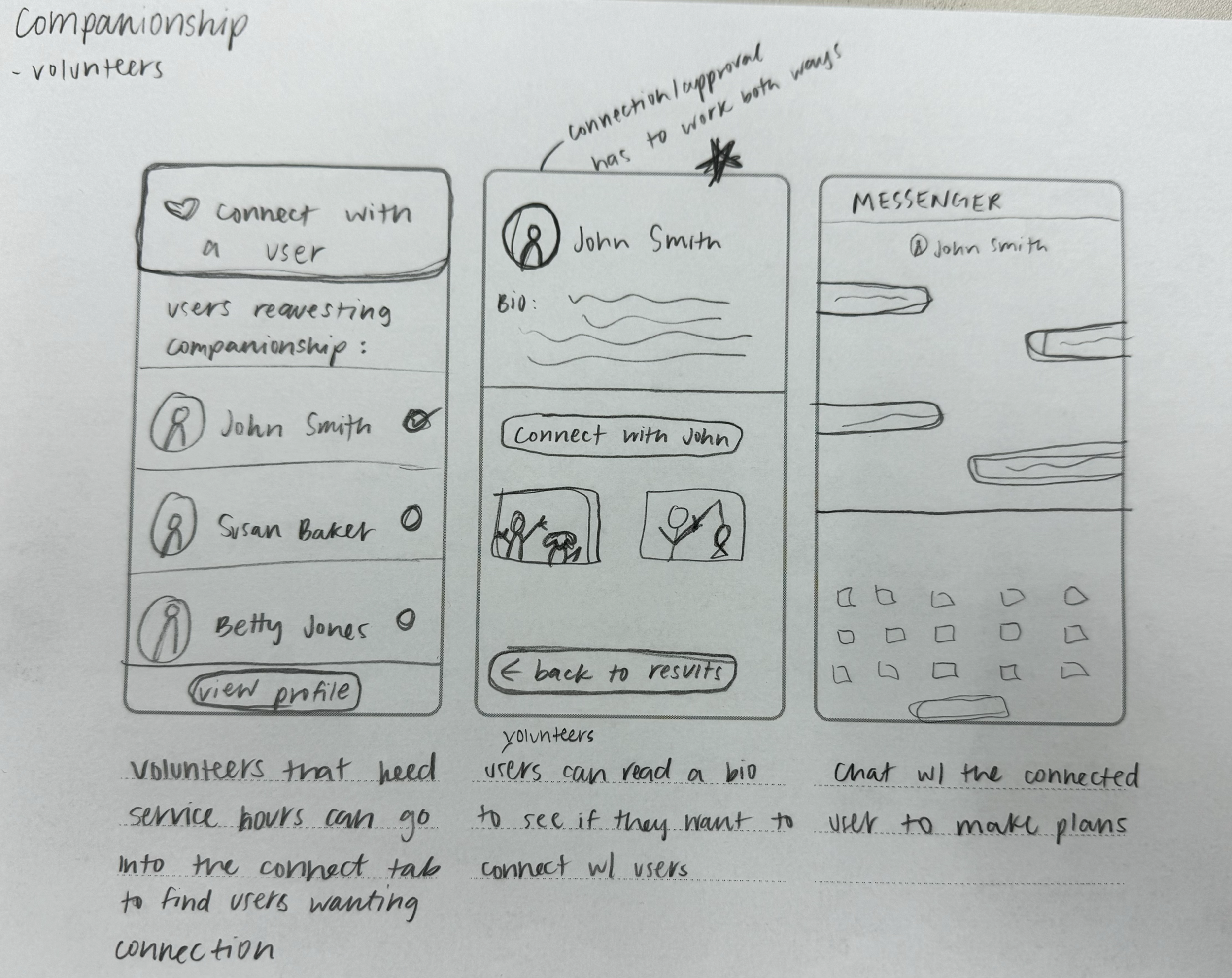
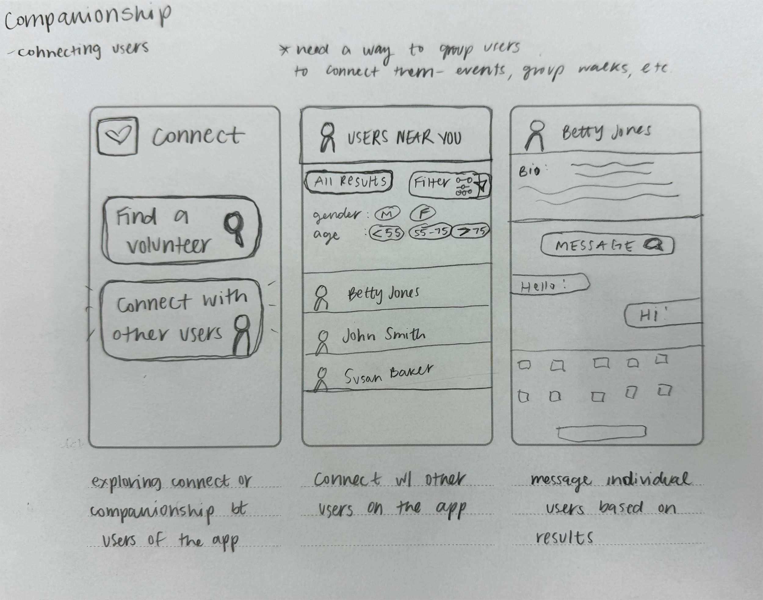
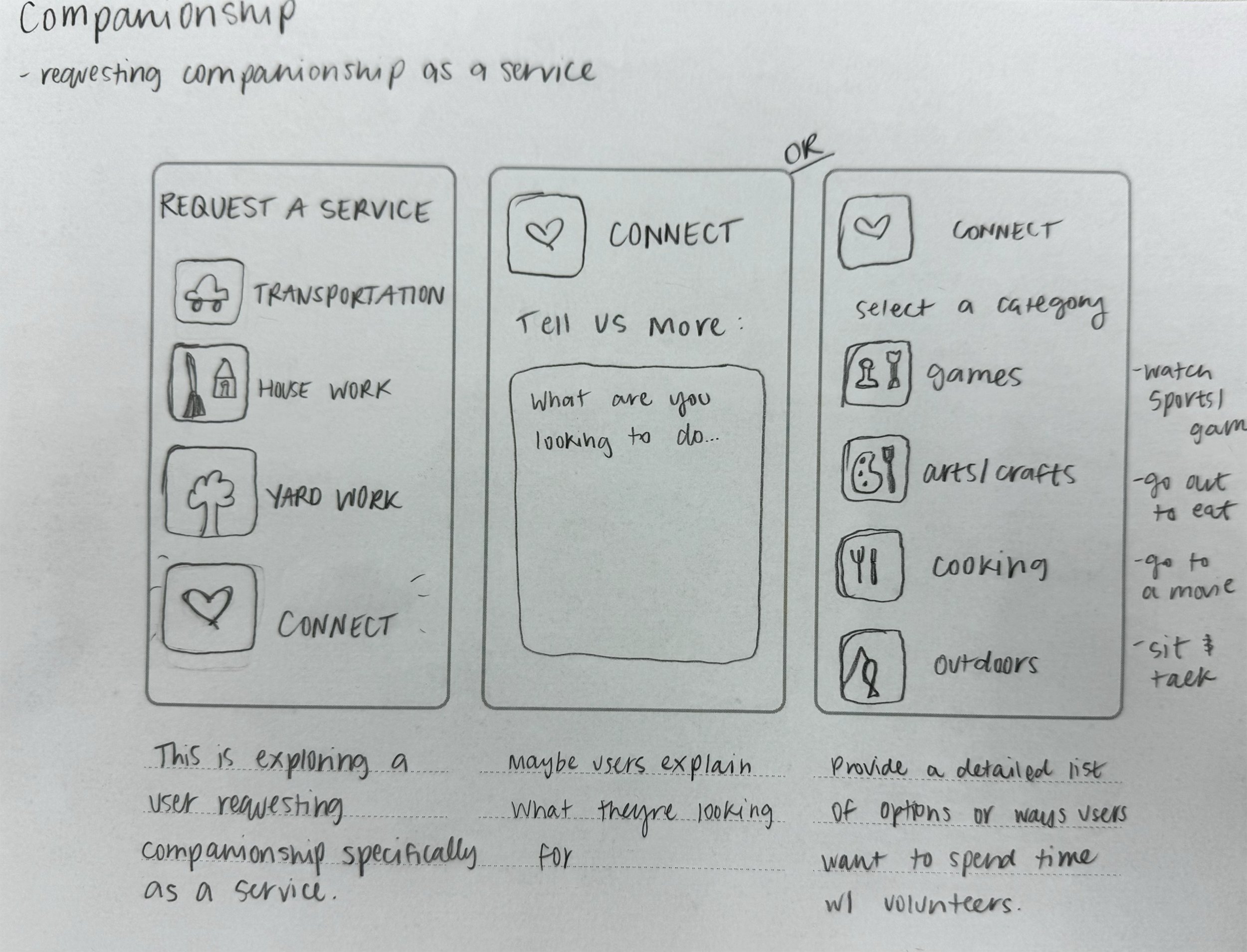
Initial wireframes explored how users would schedule a service, and a child portal where children of elderly individuals could schedule services and monitor them live during said service. We recognized that the child portal defeated our purpose of creating an app that could be used by seniors without assistance, so this idea was later removed.
***pics
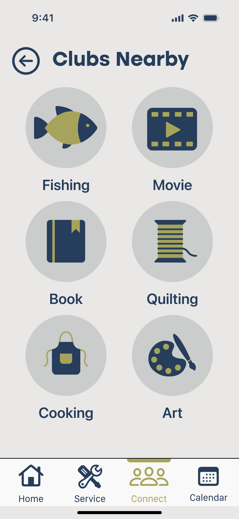
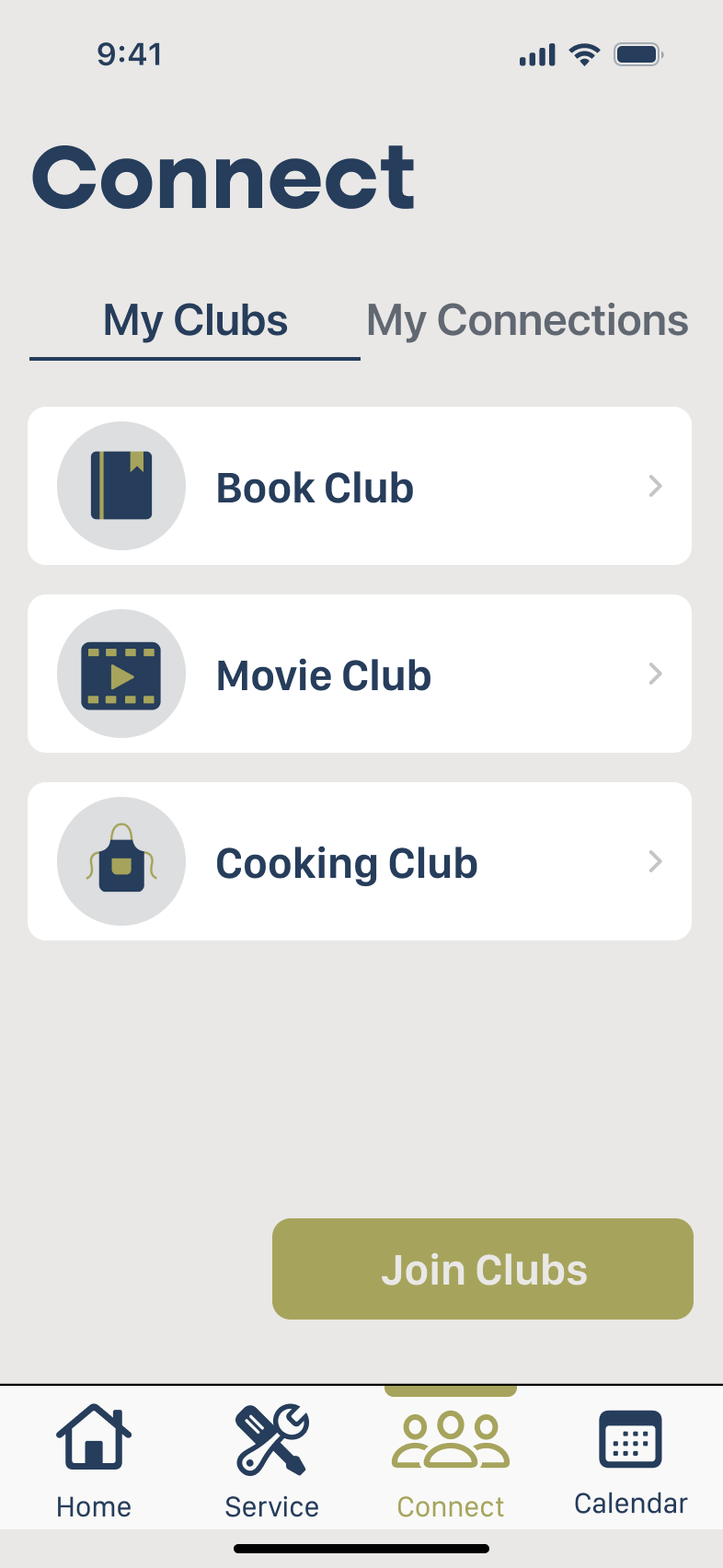
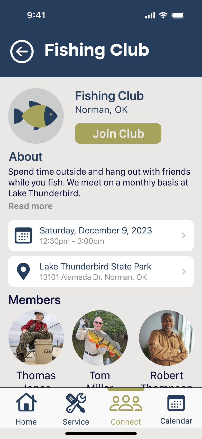
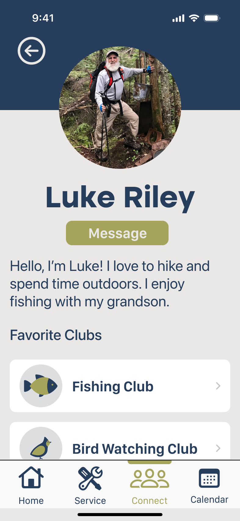
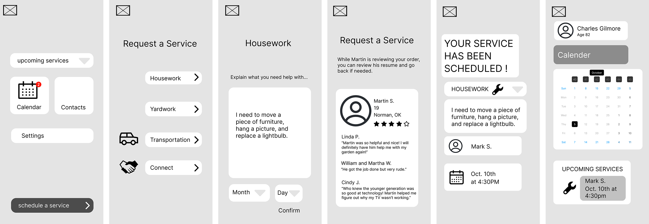
Later wireframe iterations explored a version of our final app offerings. This included scheduling a service, connecting users with other users and messaging them, as well as clubs with users.
1. Test
Cognitive walkthrough: using our wireframes, we had the individuals from our interviews walk through our current design. These revealed areas of confusion and where improvements were needed. Changes included simplification of steps, clarifying the service scheduling process, adding a calendar tab, and combining the idea of personal connections and clubs into one tab.
1. Iterate (hi-fi prototype)
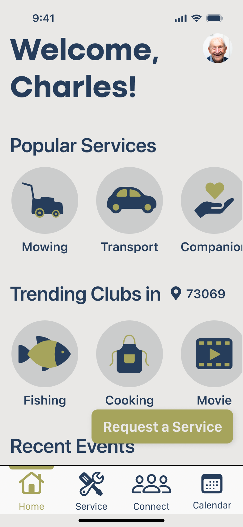
Final iterations included the necessary changes needed based on the cognitive walkthrough. We evolved the apps appearance and overall aesthetics and streamlined functionality my removing unnecessary steps and information.

